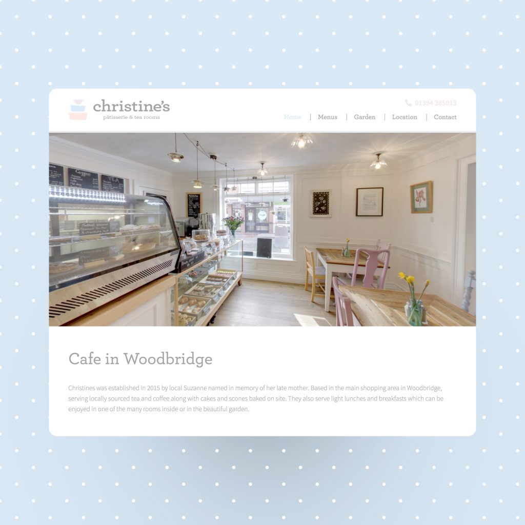
Woodbridge cafe has a new website that tells its visitors what it does.
Pubished by Adam on September 5, 2019
Seems simple, right?
One of the major reasons why people leave a website is they don’t see what they are expecting. This is referred to as a high bounce rate. On the contrary, a high bounce rate can also be contributed to when a visitor finds what they want very quickly – but that wasn’t the case here.
In the first few seconds of viewing a website, you need to tell the visitor what you do. The average visitor only stays for 15 seconds, so you haven’t got long.
Christines is a cafe in Woodbridge, they sell cakes, teas, breakfasts and lunches – and they also have a beautiful outside garden.
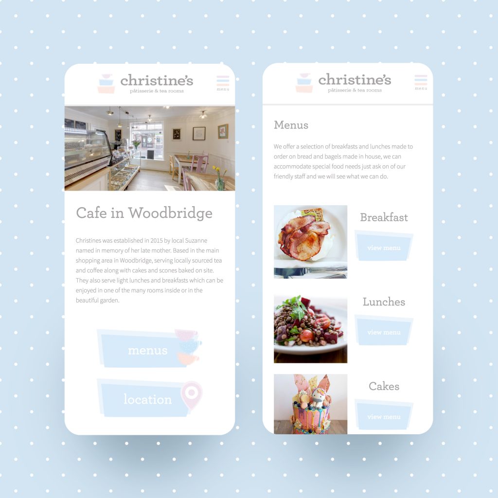
Our goal is always to deliver this message in the simplest way while making the site accessible on all devices with obvious navigation cues. Christines already had a strong brand. The branding is carried throughout everything, even each room in the cafe is beautifully branded, right down to matching colour chairs. So, it’s important that the website is consistent – the website must ooze brand and deliver the same experience as sitting at a table in the cafe does.
The website needed to centre around the most important information a visitor would be looking for. So for a cafe, I think you’ll agree, what’s on the menu and how do I find you. So, you’ll see big buttons linking to those areas of the website and easy accessibility from the menu.
We developed a bespoke WordPress theme for the client. They’ll be able to grow the website while ensuring the site remains consistent in its look, continuing to deliver all of the key points above.
A nice little website and their cakes are so good too!
My kids love the unicorn biscuits.

Website: http://www.christinescakeshop.co.uk
